
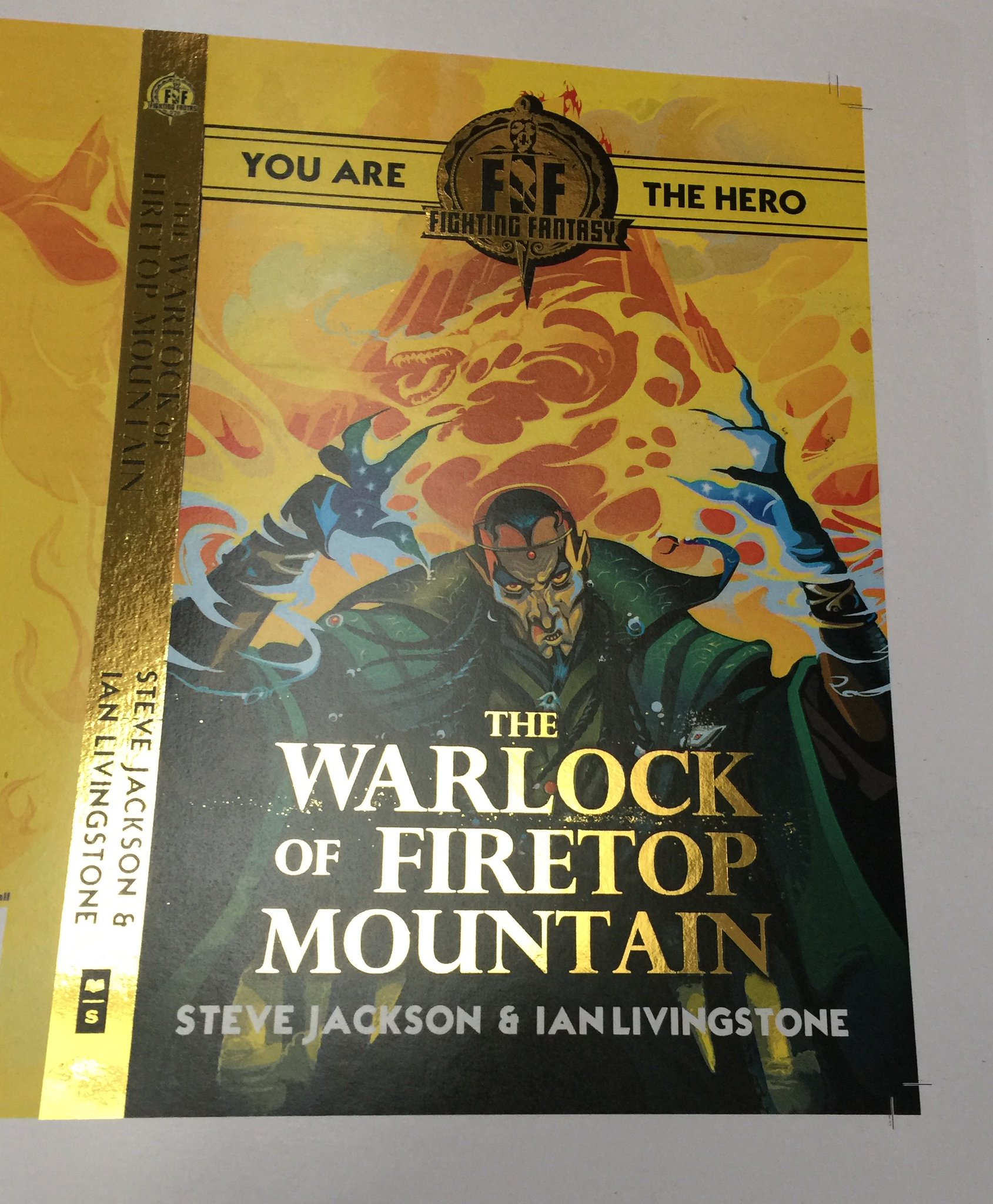
Ok so im a couple of days late because I didn’t think I could really be bothered to talk about this. However, scholastic have released the cover art of Ian Livingstone’s brand new FF book, Port Of Peril. I first started reading FF during the greenspine era around 1988, and as such have been weened on the realistic lifelike strokes of such artists as Les Edwards, Ian McCaig, Jim Burns and a whole load more. The new cover art is somewhat more cartoonish, with bold colours rather than blended and angled lines rather than curved. Such is the style of the artists Robert M Ball who has taken on the project. They somewhat remind me of the old Tunnels & Trolls book coverart.
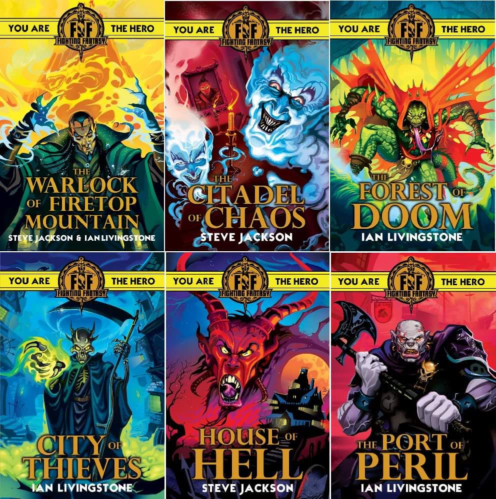
A lot of fans, myself included will take time to adjust to this entirely new look with the FF facebook threads being something of a debate on the matter. After a bit of research however I have found out kids today are favouring this new art format over the old. At least with one cover artist all the books will look consistently designed. Another nice touch Ian himself let slip is there are no more greenspines they have been upgraded to a very eye catching gold foil, as have the dagger logo and title. Who doesn’t like gold right? Apart from maybe the crap Cybermen off Doctor Who!
So as a purist, I’m going to miss the old cover art and swallow a rather bitter pill. But as for the series, I think its got a tough challenge ahead levering kids off of video games but if it works then the future of FF and likelihood of more new adventures will be in good stead. It’s a good time for us to all test for LUCK.


You must be logged in to post a comment.