
Whilst many of us have still to get our hands on a copy of the Scholastic reissues of Fighting Fantasy, the gang have been circulating enough plot points and pictures to do a personal mini review here. We find that the illustrations are not really what us fanboys turned men (and women heheh) are used to. They are very angular and cheap looking which has come as a downer. The good news is Ian Livingstone’s new adventure is true to his usual form, with an enjoyable yarn in which you need to find a multitude of items to take along the way.

(The Ghoul in Warlock Of Firetop Mountain by Vlado Krizan. That’s a skeleton not a ghoul. “Semi decayed man…”? Theres nothing left of him grrrr!!!)
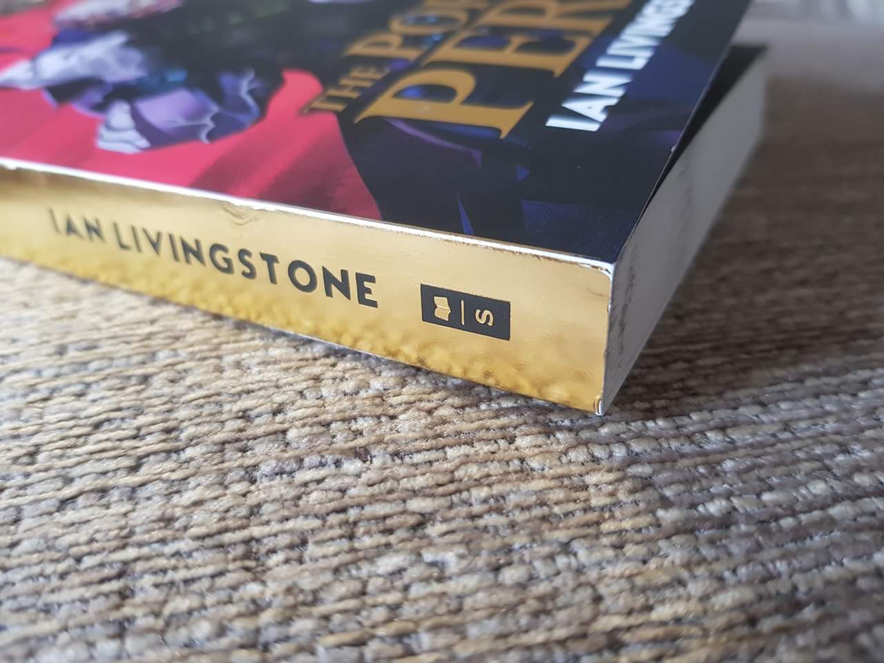
(Foiled again! Photos by Kevin Abbotts and Paul Berry)
People are already having trouble with the gold foil in the bookspines. They haven’t had their copies more than a day and its beginning to fray and peel already. All in all, production and design of the iconic book series’ new look is quite a hash. Personally I’m only interested in the new adventure and hope their are more thus I shall only invest in the limited edition of Port Of Peril at this point partially due to Iain McCaigs incredible cover for now. 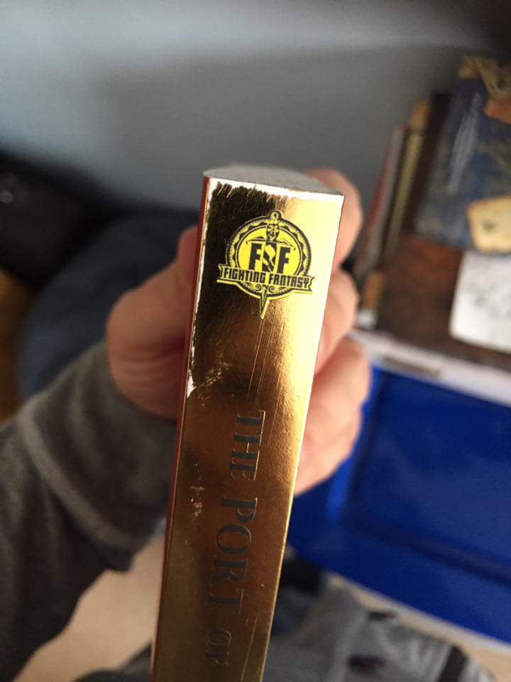
I very much doubt scholastic will care to actually give their audience what they want with their daft ‘we are selling to kids of today art’ approach …(this is bum cum, the cover and internal art are no different to some tacky Choose You Own Adventure books of the early 80s they’ve just gone for the cheap option) …while alienating a 30 year fan base of thousands. My gut reaction is this could all fizzle out soon like it did for Wizard books only much faster and that would be a great shame given the writing of the new adventure is on par. I hope not, but I’m listening out…


You must be logged in to post a comment.